This project will create online wizards to let users easily create and customize interactive visualizations with their own network and geospatial data. Before the wizard is finished, we are very excited to release demo visualizations as examples of what users will be able to produce and customize. We are very keen to get your feedback on how the visualizations work, what customization options are needed, and other general feedback. We’ve tested these visualizations in the latest versions of Safari, Firefox, Opera, and Chrome on Windows, Linux, and Mac, but we consider these to be very much work-in-progress. The more specific you can be in describing any suggestions or issues the better. Please at a minimum include your operating system (Windows, Mac, Linux) and browser version.
Click an image below to launch that visualization. Alternatively view our open-source code on GitHub.
DEMO #1
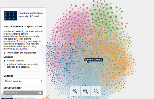
Visualizing network data is a prime example of a research activity where both desktop tools and online libraries exist, but are not well connected with one another. Desktop software like NodeXL and Gephi provide the ability to collect and visualize network data (users on Twitter, videos on YouTube, etc.). These applications, however, provide limited facilities for hosting, sharing, and optimizing visualizations for the web. Numerous technologies, frameworks and platforms exist for displaying network data online, but they often depend on bespoke data formats or a high degree of technical expertise.
The visualization below was produced without a single line of code needing to be written. Data was collected through NodeXL and visualized with Gephi.
However, when trying to share this visualization online, the software we had used to create it left us wanting. The only option readily available was to export as an image and post it to a blog, department website, or gallery. There are numerous practical reasons that this solution was undesirable. For example, it would have been necessary to export at an extremely high resolution to preserve the legibility of the smallest nodes, but this would have created an impractical file size. Also, navigating such a large image file in a web-browser would likely prove awkward and difficult to manage for users, which would limit the intelligibility of the visualization. However, perhaps a more pertinent issue concerns the general usefulness of static network visualizations. When viewed in Gephi or NodeXL, the easy accessibility of node and edge attributes encouraged the data to be explored. These attributes are flattened and reduced to purely visual indicators when a static visualization is created.
Network visualizations like this one seem a prime candidate for interactivity, and indeed great work has already been done with the Sigma.js JavaScript library to enable the rendering of network graphs with HTML5 canvas. This library allows all newer browsers as well as tablet devices and phones to display the visualization without any extra plugins (e.g. Flash) or software (e.g. Java) needing to be installed.
Sigma.js does, however, require knowledge of JavaScript and HTML to produce an interactive network diagram. The amount of knowledge required grows further if the creator of a visualization wishes to provide an infobox with more node information, an ability to search for a specific node, or to change fonts and colours. The library also could be improved in some subtle, but important, ways: we’d like to add the ability to detect when the user positions the cursor over a specific edge, properly handle redrawing on tablets when the visualization is zoomed, and provide the option for edges to be a blend of the colours of the two nodes they connect. We will work to make these changes and provide a hosted wizard to allow a user to easily create and customize the visualization (what attributes of a node should be shown on click, what title and explanatory text should be included, should any edge information be shown on hover, should a search function be included, etc.).
Before the wizard is released, however, we are very excited to release two demo visualizations as examples of what could be produced and customized with the wizard. We’ve tested these visualizations in the latest versions of Safari, Firefox, Opera, and Chrome on Windows, Linux, and Mac, but we consider these to be very much work-in-progress. We’re releasing them to get feedback that we can incorporate into the project. The more specific you can be in describing any suggestions or issues the better. Please at a minimum include your operating system (Windows, Mac, Linux) and browser version.
Visualization of followers at @OIITwitter
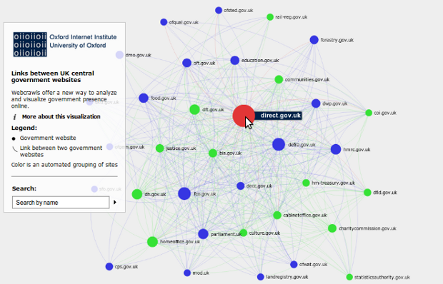
Visualization of UK Central Government
DEMO #2
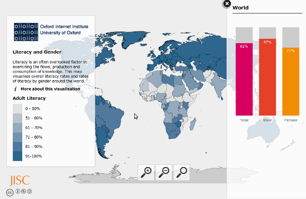
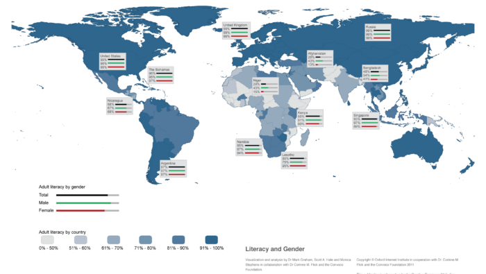
As with the network diagrams discussed earlier, geographic data can often benefit from the ability to be explored in an interactive manner. The World Bank has many statistics on a per country basis as do other organizations. The CIA World Fact Book also has many statistics like this useful listing of literacy broken down by gender.
After converting the above data to tabular form, it was possible to produce a map with each country shaded according to one attribute (such maps are called choropleth maps). These can be produced as static images with desktop software including the commercial application arcGIS or the open-source alternative qGIS. The CIA literacy data, however, has three statistics per country: total literacy, male literacy, and female literacy. With static images, it could be possible to show these three statistics on three separate maps or to use shading with a bar chart on top of each country. Neither of these solutions is ideal, however. Separate maps are sometimes difficult to compare, while the use of bars for every country quickly makes the map too crowded. On the earlier static image of this data shown below, we compromised by including the break down by gender for only some countries.
Literacy and Gender
The static image, however, is less than ideal. Exact numbers and gender breakdowns are only available for a small number of countries that the authors selected. In addition, the colours of the smallest countries are harder to see. So, whether it’s literacy, internet usage, income, tweets, Wikipedia edits, or another statistic, interactivity is a key way to allow the user to get exact numbers, view smaller countries, and see a break down of additional information for every country. The additional information in this example is male and female literacy shown with bars, but it could be a line plot showing change over time or text information.
So, without further ado please find below a demo visualization of what we’d like to allow users to produce and customize with a future web-based wizard. We’ve tested this visualization in the latest versions of Safari, Firefox, Opera, and Chrome on Windows, Linux, and Mac, but we consider it to be very much a work-in-progress. We’re releasing it to get feedback that we can incorporate into the project. The more specific you can be in describing any suggestions or issues the better. Please at a minimum include your operating system (Windows, Mac, Linux) and browser version.
Visualization of Literacy and Gender
DEMO #3
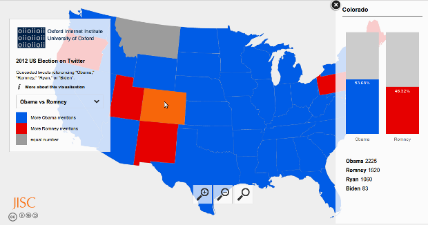
Interactive world maps are great, but the excitement over the US Presidential Election left us wanting to get a bit more detail. Data collected by Mark Graham, Adham Tamer, Ning Wang, and I (Scott Hale) created the opportunity to try this. I built a new US State Map template based on this Wikipedia map, and the result follows. Mark has a much more detailed discussion of the data on his blog under Obama wins the election! (on Twitter). Enjoy! The US state map option will be added to the map creation wizard in due course.
US Elections on Twitter